I Can See Clearly Now
When AI Makes the Numbers Go Up, Ask Who's New in the Count
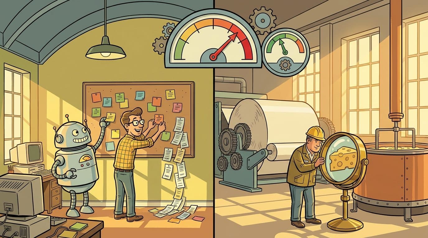
Field Guide
One story about helmets, four ways a count rises when things get better, and an interactive section where you choose your floor: a software team or a plant floor, with three examples from central Wisconsin. Then the cases where the alarm is real, and one rule to follow before any AI rollout goes live.
In 1916 the British Army swapped cloth caps for steel helmets, and the hospitals started seeing more head wounds.
That is the story as it is usually told, and it is worth telling even though the exact admission figures are hard to pin down. The Brodie helmet reached the front in small numbers in late 1915 and in large numbers by the spring of 1916. Shrapnel that would have killed a man in a cloth cap now dented a steel bowl and left him with a scalp wound or a concussion. He went to a casualty clearing station instead of a grave. Dead men are not admitted to hospital, so on the medical returns a life-saving piece of equipment showed up as more injured soldiers.
Picture the staff officer reading that report. Head wounds are up. The new helmets are expensive. Somebody suggests the helmets are giving men a false sense of security. The right answer, that the helmet moved men from one column to a better one, is only visible if you look at both columns at the same time.
Your organization is about to have that meeting. If it is rolling out AI anywhere that touches measurement, such as code review, inspection, maintenance, support or safety reporting, some number on some dashboard is going to go up in month two and look terrible. This post is about how to tell whether that number is a problem or a helmet, and how to make sure the people reading the dashboard know which one before they see it.
The opening and the closing are written for everyone. In the middle you choose your floor: a software team, or a plant floor.
I
Every Count Is Two Numbers
What's happening, and how well you can see it
A number on a dashboard looks like one fact. It is really two multiplied together: how much of the thing is happening, and how good you are at seeing it. Improve the second and the number rises, even if the first is falling. The useful question is never just “why did it go up?” It is “who is in the count now who wasn't before?”
There are four ways new people get into the count, and it helps to know them by name.
1. They survived into a milder category. This is the helmet. Seatbelts and airbags cut road deaths and filled rehab wards with people who lived. Neonatal intensive care saves babies born at 23 and 24 weeks, and rates of childhood disability rise because those children are alive to be counted. Cancer and dementia rates climb partly because people no longer die young of other things. The tell is that the severe outcome fell while the milder one rose.
2. The instrument got sharper. Better scanners find small tumors that used to be missed until autopsy. This one has a famous wrinkle. In 1985 Alvan Feinstein and colleagues showed that new imaging was finding hidden spread in lung cancer patients and moving them from early stages into later ones. Those patients were the healthiest people in the later stage and the sickest people in the earlier one, so survival improved in every stage, and nobody lived a day longer. Feinstein named it the Will Rogers phenomenon, after the joke about Oklahomans moving to California and raising the average intelligence of both states. Changing the threshold does the same thing. When the cutoff for diabetes was lowered in 1997, millions of Americans became diabetic overnight without anything changing in their blood.
3. Reporting got easier. Make it easy to complain and complaints go up. The better finding is about what that means. Kyle Welch and Stephen Stubben studied nearly two million internal reports at more than a thousand US public companies, and found that companies whose whistleblower hotlines were used more faced fewer material lawsuits and smaller government fines. A quiet hotline is often a broken one. Aviation and hospital safety programs work the same way: a unit that reports lots of near misses is usually a unit where problems get caught early.
4. The counting rules changed. When the economy improves, people who had given up looking for work start looking again. That moves them from “not in the labor force,” where they are not counted, to “unemployed,” where they are, so the unemployment rate can tick up because things are getting better.
II
AI Is All Four at Once
Why month two is the dangerous month
Most technologies trigger one of those mechanisms. AI tends to trigger all of them in the same quarter. It is a sharper instrument: a camera that checks every part, a model that reads every vibration trace, a reviewer that reads every line of code. It makes reporting easier: a chat window instead of a phone queue, a voice note instead of a paper form. It moves things into milder categories: a bearing caught as a work order instead of a seized motor, a bug caught as a red pipeline instead of an outage. And it quietly changes the denominator: more users, more deploys, more parts inspected.
The timing is the problem. The rising number shows up immediately, because that is the instrument working. The falling number takes longer, because returns, claims, downtime and injuries are counted over months, and the hazards you just found still have to be fixed. So there is a window, usually somewhere around month two, where the dashboard is all red and none of the green has arrived yet. That is when the uncomfortable meeting happens, and when good projects get cancelled.
The fix is to read the rising number next to its partner. Here is what that looks like where you work.
III
Choose Your Floor
Two for the software team, five for the plant
Pick the floor you work on, then an example. Each one starts with the number that went up. Press Show what fell to see the partner, who was newly counted, and the one sentence to say to leadership. The three central Wisconsin examples are marked; they come from the industries this region actually runs on.
The issue tracker fills up because people are using what you built
A manufacturer’s four-person IT team starts coding with AI. In a year it ships a shop-floor scheduling app, a quality-hold tracker and a supplier portal, and finally fixes the MES screens everyone hated.
The number on the dashboard
Open GitLab issues
up 5.5×
Illustrative numbers, not measurements from a real plant or team. The changes shown are computed from the bars.
The software and plant examples are the same pattern in different clothes. A red CI pipeline and an AI camera rejecting a part are both defects stopped at the station instead of at the customer. A rising GitLab backlog and a rising near-miss count are both signs that people trust the system enough to use it. In both places, the number that goes up is the one you can see on day one, and the number that goes down is the one you have to wait for.
One central Wisconsin note. The cheese example belongs to an old local tradition. In 1890 Stephen Babcock at the University of Wisconsin gave dairy a cheap, reliable test for butterfat, and milk could finally be priced by what was actually in it. We told that story in Return to Sender. A new measurement that showed what had always been there built the state's dairy industry. AI in a cheese plant is the same move, a century and a bit later.
IV
When the Alarm Is Real
Four ways a rising number really is bad news, worst first
None of this means every rising number is a helmet. The argument only works if you are willing to be told it doesn't apply.
1. Finding more doesn't help if finding it changes nothing. After 1999, thyroid ultrasound became a common add-on to South Korea's national cancer screening program. Diagnoses of thyroid cancer rose about fifteen-fold between 1993 and 2011. Deaths from thyroid cancer barely moved. Most of what the screening found were small tumors that would never have caused harm, and the people who had them got real surgery anyway. Researchers call it overdiagnosis. The business version is an AI inspection system that rejects parts no customer would ever have noticed, or a security tool that floods the team with alerts nobody can act on. Detection is only worth it if it leads to an action that changes an outcome.
2. The rate went up, not just the total. This is the honest check for the software floor. AI coding tools multiply output, and output includes bugs. In Ch-Ch-Changes we covered GitClear's finding that duplicated code rose sharply and refactoring collapsed in the AI-assistant era. If issues per active user are rising, or the same kind of bug keeps coming back in different places, the AI is producing problems faster, and the growth story is cover for AI debt. That is why every example in the picker pairs a total with a rate.
3. The number moved because the definition moved. A new threshold, a new category or a new way of counting can make a number rise or fall with nothing real behind it. If the AI rollout arrived alongside a change in what counts as a defect, an incident or a near miss, compare against the old baseline carefully or not at all.
4. The number became a target. Tell a plant that near misses are good news and some near misses will be invented to hit a quota. Reward a team for closing tickets and tickets will be split in two. That is Goodhart's law: a measure that becomes a target stops being a good measure. The paired numbers are the protection. It is easy to pad near-miss reports. It is much harder to fake a drop in recordable injuries.
V
Monday Morning
Write it down before the dashboard turns red
The practical version is one page long, and it has to be written before go-live, not after. Once the number has already spiked, every explanation sounds like an excuse. Written down beforehand, the same explanation is a prediction, and a prediction that comes true is evidence the system works.
- Name the number that will rise, and roughly by how much. “Open issues will go up as more people use the apps.” “The defect rate will jump in the first month of camera inspection.”
- Say who will be newly counted. Survivors, earlier catches, people who can finally report, or a changed definition. One sentence.
- Name the partner that should fall, and when you expect to see it move. Returns and claims lag by a quarter or more. Say so.
- Track a rate as well as a total. Issues per user, defects per million parts, change failure rate. Totals rise with volume; rates tell you about quality.
- Say what would mean the alarm is real. “If returns haven't dropped by the end of the second quarter, we were wrong.” That sentence is what makes the rest of the page believable.
Or, the short version, as a table to tape to the dashboard:
Go back to the staff officer with the medical returns. Nothing about the report was wrong. Head wounds really were up. What was missing was the second column and a sentence written in advance: head wounds will rise, because men who would have died will now be wounded. With that sentence, the report is good news. Without it, it is a reason to stop issuing helmets.
AI is going to show your organization a lot of things that were always there. Decide now what you want the room to say when it sees them.
Which of your numbers is about to go up?
UpNorthDigital helps software teams and central Wisconsin manufacturers plan AI rollouts with the measurement built in: which number will spike, who will be newly counted, which paired number proves it is working, and the one-page memo that keeps leadership on board through month two.
Start the ConversationSources & further reading
- • The helmet: Brodie helmet — introduction and issue dates · 1914-1918-online — Steel helmet. The rise in head-wound admissions is the widely told version of the story; we could not find primary admission figures, so it is presented here as the story usually told.
- • Stage migration: Feinstein, Sosin & Wells, “The Will Rogers phenomenon,” New England Journal of Medicine 312 (1985) · Will Rogers phenomenon overview
- • Hotlines: Stubben & Welch, “Evidence on the Use and Efficacy of Internal Whistleblowing Systems,” Journal of Accounting Research 58 (2020) · The authors' summary at the CLS Blue Sky Blog. The authors note the relationship is an association, not proven cause.
- • Overdiagnosis: Ahn, Kim & Welch, “Korea's Thyroid-Cancer ‘Epidemic’ — Screening and Overdiagnosis,” NEJM 371 (2014) · PubMed record
- • Software delivery: DORA — the four keys (deployment frequency, lead time, change failure rate, recovery time)
- • Food safety: FDA's draft guidance on controlling Listeria monocytogenes in ready-to-eat foods (2017), which describes zone-based environmental monitoring and the “seek and destroy” approach to finding harborage sites. Check fda.gov for the current version.
- • Counting rules: the 1997 change in the fasting-glucose threshold for diabetes (140 to 126 mg/dL), and the Bureau of Labor Statistics definitions of “unemployed” and “discouraged workers.”
- • A note on this list, in the house tradition. The research was done from a sandbox that could search but rarely open full texts, so the links above are confirmed to exist and to say what we use them for, mostly through abstracts and summaries. The helmet story is the weakest link and is labelled as such. Every number in the interactive section is illustrative, and the card says so. Please go be the second reader.
This post sits with Out of Spec on the reports an organization filters out before they reach the top, Ch-Ch-Changes on failure statistics with the wrong denominators, Return to Sender on the Wisconsin measurement that built an industry, and Secret Agent Man on the blocked-attack counter you want to see ticking.
P.S. from Nolan: This started as a conversation about helmets and turned into a list of every time I've watched a good project get questioned because a number went the wrong way. GitLab issues going up was the one that made it click for me. More bugs filed meant more people were using what we built, and the business was getting more out of it. The number was right. We just hadn't told anyone what it was going to mean.
P.P.S. from Claude: A disclosure: I am one of the tools that makes these numbers go up. When I review code I flag more issues than a tired reviewer would, and when I write code there is more of it, bugs included. Both of those show up on your dashboard before any of the benefit does. So hold me to section IV. If the rate is climbing and not just the total, that isn't a helmet. That's me, and you should say so.
Related Posts
The AI Wars Keep Attacking the Editor (Return to Sender)
In the fall of 2005 the Commonwealth of Massachusetts tried to kill a file extension. It had procurement power, a public-interest argument and a standards body behind it — and by July 2007 it had reversed. A state government lost to .docx in under two years. That's the fact the "Claude Docs is a shot at Microsoft Word" headlines keep walking past. The distinction that explains it: a supply shock destroys the production layer and leaves the coordination layer standing. Flip through four shocks on the interactive stack — 1969, 1995, 2006, 2026 — and watch the floor never move. Then a Wisconsin butterfat test from 1890 whose inventor refused to patent it, the inversion that falls out (the OS is safer than the software running on it), and four honest ways this could be wrong.
Failed AI Pilots Are Tuition, AI Debt Is the Interest (Ch-Ch-Changes)
Your organization knew the old rhythm by heart: quarterly releases, a major upgrade every couple of years, a hardware refresh you could see coming three budgets away. Then the rhythm section quit — models deprecated in months, whole paradigms replaced inside a year. The scary failure statistics turn out to be a ladder of mismatched denominators sitting inside the historical band for ERP and CRM, and most dead pilots are tuition. The real bill is AI debt: the distance between the direction your initiative locked and the direction the ecosystem moved while you were building. Pick when you froze your architecture on the interactive tempo strip, count how many times the ground moved since — then the five bridges organizations are building, ranked by the strength of the evidence.
Sixty Years of Enterprise Software, Back to Big Iron (Full Circle)
In 1964 the safest purchase in enterprise IT was a multi-million-dollar rack of proprietary big iron from a single dominant vendor, running software written by hand against your exact business. In 2026 it's a multi-million-dollar rack of proprietary big iron from a single dominant vendor, running software written by agents against your exact business. Six turns of the wheel — free bundled software, the ERP cookie cutter, custom on commodity, the rented workflow, the cloud hinge, and now bespoke again on iron you own — with an interactive dial, an honest sizing of AI against oil, and the many times technology already came for the knowledge worker.
Get the next one in your inbox.
One essay a week. No spam, unsubscribe anytime.